
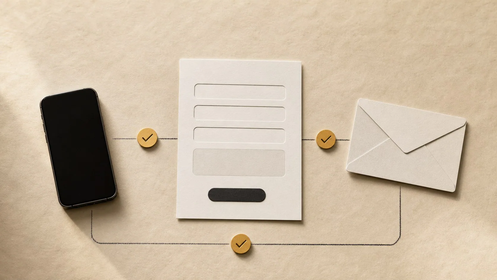
Accessibility fixes can also remove conversion friction because clear labels, visible focus, readable contrast, logical headings, keyboard access, useful error messages and reduced-motion support make actions easier to complete. Treat accessibility as access for people, not a conversion hack. Test with keyboard navigation, zoom, screen-reader semantics and real form states, and use WCAG as a baseline rather than relying on an automated score alone.
Accessibility is not a trick for increasing conversions.
It is the work of making a website usable by people with different visual, hearing, motor and cognitive needs and by people using assistive technology.
Some of the same barriers also stop other visitors from completing an enquiry. Fix them because people need access. The conversion benefit is a useful side effect.
Give every form field a real label
A placeholder is not a reliable label.
Use a visible label that remains available after the visitor starts typing:
<label for="email">Email address</label>
<input id="email" name="email" type="email" autocomplete="email">
This helps screen-reader users understand the field and helps anyone returning to a partially completed form remember what the value means.
Keep required and optional states clear in text.
Write error messages that explain the correction
“Invalid input” gives the user almost nothing.
Use specific feedback:
Enter a complete email address, for example name@company.co.za.
Place the message near the relevant field and connect it programmatically where appropriate.
Do not clear all entered values because one field failed validation.
A user should be able to correct the problem without starting again.
Make focus visible
Keyboard users need to see which interactive element currently has focus.
Do not remove browser focus outlines unless you replace them with a clearly visible focus style.
Test the entire page using only:
- Tab;
- Shift + Tab;
- Enter;
- Space;
- arrow keys where the component requires them;
- Escape for dialogs and menus where expected.
If you lose track of focus, the interface needs work.
This test also catches hidden links, inaccessible menus and buttons that are only clickable with a mouse.
Keep text contrast readable
Light grey body copy on white can look refined in a design mock-up and become difficult to read on a phone in bright daylight.
Check text and interactive-control contrast against WCAG criteria.
Do not solve contrast by making every element black. Use the brand palette deliberately and reserve low-contrast colours for decorative elements that do not carry essential information.
Test hover, focus, disabled and error states too.
Use headings to describe structure
A page should have a logical heading outline that reflects its content.
Use headings for sections, not only for visual size.
A service page might have:
H1 Website redesign for service businesses
  H2 When a redesign makes sense
  H2 What the project includes
    H3 Enquiry journey
    H3 Mobile experience
  H2 Selected work
  H2 Pricing and next step
Do not choose h4 because it happens to have the font size you want.
Style the correct semantic heading with CSS.
Give images useful alternative text
Alternative text should communicate the purpose of a meaningful image.
For a screenshot showing a redesigned booking interface:
Mobile booking screen with service selection, date picker and confirmation button.
For a decorative shape that adds no information, an empty alt="" may be appropriate.
Do not repeat “image of” in every alt text or stuff service keywords into it.
A logo needs an accessible name that identifies the business where that identification is useful.
Make buttons and links say what they do
“Click here” loses context when read outside the surrounding paragraph.
Use labels such as:
- View website pricing;
- Download the accessibility checklist;
- Ask about website redesign;
- Read the MMRisk case study.
Do not put the same “Learn more” label on six cards when each link goes somewhere different.
Clear labels also help sighted users scan the page quickly.
Build menus that work without a mouse
Test desktop and mobile navigation with keyboard controls.
Check that:
- menu button has an accessible name;
- expanded/collapsed state is communicated;
- focus moves predictably;
- focus is not trapped accidentally;
- Escape closes overlays where appropriate;
- links are reachable;
- background content is handled correctly when a modal menu is open.
A visually impressive menu is still broken if a keyboard user cannot reach the contact page.
Respect zoom and text resizing
Test at 200% browser zoom and with larger system text where possible.
Look for:
- clipped headings;
- horizontal scrolling;
- overlapping cards;
- buttons with truncated labels;
- form controls hidden below fixed elements;
- navigation that becomes unusable.
Do not disable zoom on mobile.
A responsive layout should reflow instead of protecting the original mock-up dimensions.
Respect reduced-motion preferences
Scroll-triggered motion can create nausea or make reading difficult for some users.
Use prefers-reduced-motion to reduce or remove non-essential animation.
Important information should not depend on animation completing.
A service heading should remain readable even if the user disables the parallax effect around it.
Give video and audio an accessible alternative
If a video contains important spoken information, provide captions or a transcript appropriate to the content.
Avoid autoplaying audio.
Give users control over playback and avoid placing critical instructions only inside a video when the rest of the page needs them.
Check modal and popup behaviour
A newsletter popup or project form can create serious access problems.
Test:
- focus enters the dialog;
- dialog has an accessible name;
- close button is reachable;
- Escape behaviour is appropriate;
- focus returns to the triggering element after close;
- background content is not accidentally interactive while the modal is open.
Do not make the close control a tiny grey “×” that disappears on mobile.
Use automated tools as a first pass
Automated accessibility testing can find issues such as missing labels, duplicate IDs and some contrast problems.
It cannot tell you whether:
- the page makes sense;
- alt text is useful;
- focus order is logical;
- a screen-reader announcement is understandable;
- a form error gives enough context;
- the workflow can actually be completed.
Combine automated checks with manual keyboard and assistive-technology testing.
Connect accessibility testing to the enquiry journey
Prioritise the actions a customer needs:
- Understand the service.
- Navigate to detail.
- Read proof and pricing.
- Call, WhatsApp or complete a form.
- Receive confirmation.
Test each stage without a mouse and at larger zoom.
Fix barriers before adding more decorative interaction.
Keep an accessibility QA checklist in the build process
Run it before launch and after major changes:
- page title and language;
- heading structure;
- landmarks;
- keyboard navigation;
- visible focus;
- link and button names;
- forms and errors;
- contrast;
- alt text;
- zoom/reflow;
- reduced motion;
- video captions;
- modal behaviour.
Accessibility is ongoing because the site changes.
IDJoy can include accessibility QA in a website audit or redesign alongside performance and enquiry-path testing.